Easy at the End: Examination of Peak-End Rule Applied to Amazon.com Checkout
Abstract
Amazon.com is arguably one of the largest online retailers on the planet. With more than 12.2 million products in its catalog (“How Many Products Does Amazon Actually Carry?”), Amazon’s share of ecommerce in the US was as high as 49% in 2018 (Dayton, “Amazon Statistics You Should Know”). That’s equivalent to 5 percent of all retail spending in the US. In addition, as of 2018, 95 million people had Amazon Prime memberships in the US, indicating customers keep coming back to Amazon.com. This prompts the question: Are there any laws of user experience in use that encourage this behavior?
To explore this question, I compiled and reviewed published and peer-reviewed journal articles related to peak-end rule research and ecommerce usability. I conducted a heuristic evaluation of Amazon’s shopping and checkout flow with two other UX experts. This heuristic evaluation reviewed the site using Jakob Nielsen’s 10 Usability Heuristics for User Interface Design.
I found that Amazon’s usability flies in the face of recommended practices and that the site flow is similar in structure to studies where peak-end has been validated and identified.
Description of peak-end theory
Peak-end rule, described by Daniel Kahneman and colleagues, refers to how a person’s overall recollection of an experience is strongly influenced by the peak and final moments of that experience. Research across disciplines validates this finding. Peak-end rule means that the way a person remembers an event is strongly influenced by how much discomfort is felt in the final moments.
Hypothesis
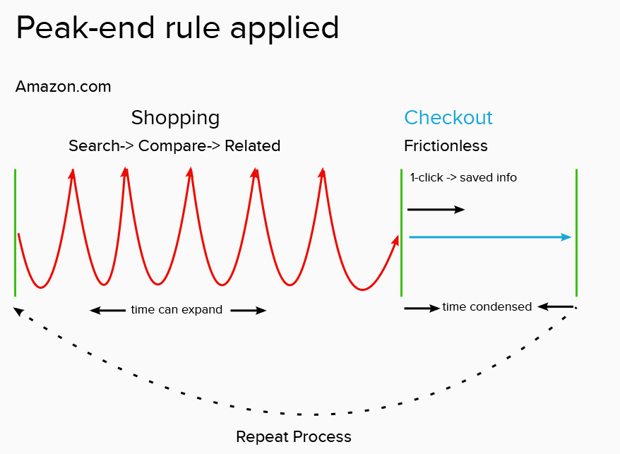
Is there evidence to suggest that Amazon’s checkout favorably influences the peak-end bias of the user? My hypothesis is that Amazon’s checkout flow creates a positive peak-end experience, which leads to favorable memories of the entire experience and encourages repeat returns to the website. This is illustrated in the following conceptual model.
Amazon Shopping and Checkout Findings
How Amazon.com shopping and checkout are structured
Shopping experience
The Amazon shopping experience ranges from straightforward to extremely complex. Users enter the website in search of a product to buy. Faced with more than 12 million products, many from third-party sellers, Amazon customers rely on the search bar to find products they are interested in. The search bar makes relevant suggestions, based on similar searches.
Individual product pages are dense with information. The clutter of the content keeps users searching for relevant information, such as sizing, reviews, and related products.
Once the user decides to purchase, they have more than one option. Depending on the product, users can “Add to Cart,” “Buy Now,” or make a “1-click purchase.” Both the “Buy Now” and “1-click purchase” options rely on the user to have an account on Amazon.
Perdana and Suzanetti state that usability factors such as readability, telepresence, and credibility provide a direct, positive impact on purchase intention. Simplicity, consistency, and interactivity have an indirect impact on intention (Perdana & Suzanetti 5).
But according to Nielsen, purchase intention is different for Amazon.com customers. Amazon relies on customer loyalty and has built its website to appeal to convenience. The multiple options for checkout allow users to choose what works best for them (“Feature Richness and User Engagement”).
Checkout experience
Once the user has decided to purchase, they have the option of bypassing the cart entirely or viewing the cart. Despite its differences with most other ecommerce sites, Amazon still has a traditional shopping cart with a familiar structure (Nielsen “Feature Richness and User Engagement”).
Following the cart review, the user can proceed to checkout. Account holders enter their username and password and then move into the checkout screen where they can review their items and make shopping and payment choices. This also follows a familiar structure and is streamlined. In fact, leaving the cart is discouraged. The familiar header at the top has disappeared and only an Amazon logo remains. Users who change their minds about the purchase must discover how to leave the checkout.
Heuristic Evaluation of Amazon.com shopping and checkout flow
In order to gain a more objective understanding of the structure of Amazon, I conducted a heuristic evaluation. The evaluation was based on Jakob Nielsen’s heuristics (“10 Usability Heuristics for User Interface Design”). Because of its size and stature, Nielsen no longer considers Amazon.com a model for ecommerce design. In fact, it operates far outside the norm in terms of the user experience (“Amazon: No Longer the Role Model for Ecommerce Design”).
“Amazon’s usability rules differ from those for most other sites because it’s big enough and established enough that many users have established a close relationship with the site and are thus willing to engage at some level of depth” (Nielsen “Feature Richness and User Engagement”).
However, a heuristic evaluation provides an understanding of how it engages with customers and funnels them to checkout.
Study Set Up
The heuristic evaluation focused only on the consumer user flow through shopping and checkout on the desktop website. The evaluators searched for three products, placed at least one of the products in the cart, then followed the path through checkup up to payment.
Evaluation Findings
Of note, the evaluators noticed these issues:
- Shopping and checkout are very different user experiences.
Evaluators found the shopping experience to be meandering and even frustrating at times. The visual clutter made it hard to find relevant information.
Nielsen backs this up in his 2005 article. “Amazon’s product pages are littered with extraneous features, ranging from a “Gold Box” over a “wish list spree” to promotions for reading glasses and other irrelevant products… Cluttered pages might work for Amazon because its users are typically long-time customers who know the features and can easily screen them out. Although first-time visitors are no doubt overwhelmed, by now they account for a tiny percentage of Amazon’s revenues” (Nielsen “Amazon: No Longer the Role Model for Ecommerce Design”). - Amazon doesn’t make it easy to browse.
Evaluators who were searching for the ability to look at the full breadth of products in a single category were out of luck. It felt like Amazon assumes its users know what they are looking for when they arrive.
Nielsen also found this. Originally published in 2005 and retweeted as recently as 2015, Nielsen stated, “Try buying a Mozart concerto or a plasma TV on Amazon. Unless you know in advance the exact product you want, Amazon’s category pages make it basically impossible to identify the best offerings” (Nielsen “Amazon: No Longer the Role Model for Ecommerce Design”).
Amazon’s core UI continues to be questioned by publications, such as Fast Company, who have stated, “Through their entire item taxonomy, Amazon’s store UX is no longer designed for your convenient shopping, it’s designed for their profitable selling” (“Life With The Dash Button”).
- Checkout follows a streamlined format designed to move users to conversion.
The checkout interface has a different header, reducing clutter and focusing the user on the essential tasks, such as choosing payment and delivery options. Users who have already saved payment and shipping methods can move even more quickly.
The tradeoff is that other essential information, such as returns and help, are buried in the small text and barely noticeable.
Summary of Journal Findings
In order to understand how peak-end rule applies to Amazon.com’s shopping and checkout flow, I conducted a literature review of journal articles to understand both ecommerce usability and how peak-end rule affects perception. I wanted to understand how usability influences perception in e-commerce.
Importance of usability with ecommerce
Usability issues can stem primarily from issues with finding relevant information, according to Pokki’s 2016 study of four e-commerce stores. This study looked at two small and two large e-commerce sites and tested users’ ability to navigate through the sites.
The research found that search and visibility of the cart were primary issues for users (Pokki 24). Usability participants had difficulty seeing the shopping cart, and they said they wanted it to be visible at all times; however, these issues were not critical enough to stop users from completing the task.
“…observations of the participants and the post-test interviews indicate that overall the problems were not critical enough to prevent participants from executing tasks, but instead were seen as a hindrance in achieving a pleasant shopping experience…Usability flaws overall might not be a major setback for users” (Pokki 30).
Amazon.com’s keyword search is the main method for finding items during the shopping experience. This feature is always visible on the desktop site, but it defies Nielsen’s recommendations for e-commerce usability because it searches the entire catalog (Nielsen “Amazon: No Longer the Role Model for Ecommerce Design”).
Amazon products also display customer reviews, which helps customers decide whether or not to purchase a product. Leino and Raiha (“Case Amazon”) have found in a study of Finnish Internet shoppers that recommendations play an important role in how users find books they wanted.
“Algorithmic recommender features helped the participants find three books out of seven while the more direct recommendations helped the users decide which items to view more closely and which items to buy” (Leino & Raiha 140).
This suggests that Amazon shoppers use the tool in purchasing decisions. Given the size of the catalog, though, it also suggests that customers spend time browsing and considering purchases, and that the process is less streamlined.
User frustration and usability problems
Peak-end has been studied in relation to user frustration for identifying usability problems. Bruun et al. (“Understanding the Relationship between Frustration and the Severity of Usability Problems”) used a combination of self-assessment, galvanic skin responses (GSR), and user gaze to see how users would respond to a search task on a website with known usability problems. The study did not find a correlation between GSR peaks and severity ratings, but it did note GSR peaks correlated with frustration scores.
“With regard to the Peak-End rule, while we caution that this may not be a causal relationship, the correlational results suggest that the post-task evaluation of Dominance could be shaped by the most recent emotional response elicited by the last usability problem as well as the most intense emotional response elicited by a usability problem” (Bruun et al. 3982).
The researchers felt they partially verified the peak-end rule. Still, this research suggests that users who encounter usability problems in an interface, causing frustration, will experience Peak-End effects.
Mental effort and demanding tasks
When users are faced with mentally challenging tasks, they tend to avoid them. Hsu et al. studied how 401 participants experienced effort and discomfort during a cognitively demanding task (“Mental effort and discomfort”). The researchers found that participants were more willing to repeat the task, based on end discomfort, but not on end effort. In other words, the willingness to repeat a behavior is based on how the participants rated the discomfort of the task, not on real-time effort.
“This finding suggests that it is not the subjective experience of effort per se, but rather the subjective experience of discomfort during a cognitively demanding task that determines choices and preferences for subsequent behaviour” (Hsu et al. “Prospective willingness to repeat cognitively demanding tasks”).
This suggests that users of e-commerce are more likely to repeat their experience of a website based on the level of peak-end discomfort, and not on overall effort of the experience.
Do, Rupert and Wolford (2008) write that peak-end doesn’t just relate to pain, but also material goods. The researchers hypothesized that participants would remember a desirable gift with less pleasure if a positive but less desirable gift were added to it, even though the addition of the second increased the total worth of the gift.
They conducted two experiments to investigate this theory. The first one was a charitable fundraiser where participants had the opportunity to choose a free DVD from a list of highly rated DVDs or from both the list of highly rated and less highly rated DVDs. The results found that participants who could only choose the single DVD from the highly rated list had a significantly higher recollection of pleasure (Do, Rupert & Wolford 97).
They also conducted an experiment with Halloween trick-or-treaters. The participants were given different combinations of candy, with a “very pleasing” treat being a Hershey bar and a “mildly pleasing” treat being a piece of bubble gum. The results replicated the findings of the first study.
“People report lower levels of overall pleasure with the addition of mild pleasure at the end of an experience. In this way, people rate less pleasure higher than more pleasure” (Do, Rupert & Wolford 98).
Peak-end effects of subjective experience
The flip side of peak-end theory is that peak negative experiences can also have a strong influence on memory. Müller, Witteman, Spijker, & Alpers studied peak-end bias in anxiety by looking at how watching a horror movie affected anxiety levels (“All’s Bad That Ends Bad”).
Their finding “clearly demonstrates that in retrospect, a frightening experience is rated as less frightening if it does not end with the most poignant moment. The experience is rated less frightening although it has the same peak and an additional anxiety-eliciting component, thereby including more anxiety in total” (Müller et al. 5).
If we apply this finding to e-commerce, it suggests that users who experience negative usability early in the process instead of the end will have a more favorable experience.
Researchers Cockburn, Quinn, & Gutwin examined the peak-end effects of subjective experience by designing an experiment to test how peak-end influences a user’s preference for interactive sequences that are objectively identical in their requirements. The researchers created a series of pages with sliders that needed to be set to target values. The amount of work varied per page. In the peak-and-end effect experience, participants were shown a page series that includes an internal and terminating page with notably lower work to compare to internal and terminating pages with notably higher work. Participants were then asked to respond to questions about their annoyance or enjoyment and estimated time (“Examining the Peak-End Effects of Subjective Experience”).
The researchers found that only changing the peak or the end of the pages with sliders had no effect. It was the combination of both that affected user preference. They concluded that “design implications of these findings suggest that simply altering the presentation order of interface components can impact remembered subjective experience” (Cockburn, Quinn, & Gutwin 365).
Furthermore, the positive peak-end condition – the one where participants were shown a page series that includes an internal and terminating page with notably lower work – was preferred over the negative peak end experiment in study surveys. They found that a significant majority of participants preferred the series designed to induce a positive peak-end experience.
This suggests that e-commerce that designs the overall user experience to induce lower perceived work at the end of the experience will be preferred to user experiences that induce a higher perceived effort. In other words, the end of the e-commerce flow – the checkout – should be perceived as less effort and time spent in order to be preferred by shoppers.
Peak-end and repeating experiences
Research has shown that peak-end theory affects whether participants are willing to repeat an experience. This work has primarily been shown in gaming, but we can draw parallels to e-commerce.
Gutwin, Rooke, Cockburn, Mandryk, and Lafreniere conducted a study of how peak-end theory affects the player experience in casual games (“Peak-End Effects on Player Experience in Casual Games”).
The researchers conducted two experiments. One experiment looked at a casual pattern matching game. They wanted to see what happened when the sequence of difficulty was manipulated to create positive, negative, and neutral peak-end effects. In the other experiment, they used a shooting game. In that study, they manipulated the balance of challenge and skill to create positive, negative, and neutral peak-end effects.
“In particular, computer games are an area where different qualities of the experience – such as difficulty or balance, and their variation over time – could have strong effects on the player’s subjective assessments of the game’s challenge, their own performance, or their preferences. Games provide an interesting platform for examining peak-end effects because the activities involved are designed to be highly engaging and immersive (e.g., fighting a series of enemies); games may also generate stronger momentary experiences than other forms of daily interactive tasks, allowing more sensitive experimental examination of peak-end effects” (Gutman et al. 5608).
Participants were asked to complete a questionnaire after each game, which measured perception.
For the first study, the researchers consistently found that participants’ perceived level of challenge was influenced by how peak-end was manipulated. The second study looked at the balance of challenge and skill. The experiments showed evidence that peak-end effects took place when difficulty and challenge-skill balance was altered. What’s more, the manipulation led to significant differences in recalled fun, interest, and willingness to repeat the games.
“High levels of challenge with insufficient skills will lead to frustration; insufficient challenge with high skills leads to boredom; and a balance between challenge and skill can optimize user engagement” (Gutman et al., 5613).
However, the researchers could not explain why the participants had their perceptions. They could only see that perception was changed. Some participants felt games that were more difficult at the end were more fun, while others rated the games with less-challenging end sequences more positively and were more likely to choose the sequence again.
This suggests that the context of peak-end is important. In the context of a game, where challenge and difficulty are appealing, the choice to repeat the experience will depend on the experience the participant seeks. Participants who enjoy challenges will seek games with sequences that are more difficult at the end, while participants that seek competence are more likely to seek games with less-challenging sequences at the end.
Amazon.com shoppers are more likely to seek competence rather than challenge in the experience. Based on the findings of the above study, manipulating the user checkout flow to end with fewer challenges is more likely to lead to favorable recall and repeat visits.
Nudging techniques to influence behavior
Gaming differs significantly from e-commerce in multiple ways. As noted above, context is one area of difference. In addition, the nature of digital games is to engage users, and games use tools to repeatedly engage with users. Commercial applications, like e-commerce, seek to engage by implementing techniques often used in video games.
One group of techniques used in interfaces is called nudging. Caraban et al. (“23 Ways to Nudge”) reviewed nudging techniques to understand which cognitive biases they fight and what they use to affect behavior change. Nudging is defined as “any aspect of the choice architecture that alters people’s behavior in a predictable way without forbidding any option or significantly changing their economic incentive” (Caraban et al. 2).
Most relevant are facilitation techniques. Caraban et al. (4) state these help decision-making by reducing the physical or mental effort an individual needs to make. What’s more, these techniques capitalize on our desire to resist change.
Default options
Default options have a significant effect on choice. Caraban et al. (4) cite a reference to a study which found a 15 percent reduction in paper use when the print option defaulted to “double-sided print.”
Positioning
The position of choices is another way to affect behavior. In one study, the researchers re-ordered the presentation of wireless networks, by placing the most secure at the top and changing the color. The change led to a significant increase in choosing secure networks (Caraban et al. 5).
Suggesting alternatives
The authors found another tactic of facilitation in suggesting alternatives. They cite a study where users of a grocery store website were given food swap suggestions. Users were more likely to accept the suggestion for roughly four out of 12 foods (Caraban et al. 5).
While not directly related to peak-end bias, this suggests that subtle changes in the user experience can engage users and affect behavior. This may also indicate how checkout behavior could be affected by nudging techniques, further streamlining the process.
Amazon uses many of these techniques in its checkout experience to influence user choice. Both default options and positioning are used in the checkout experience.
Discussion and Evidence
Both our group of evaluators and Nielsen point out issues in the user experience of Amazon shopping. Nielsen also admits that the site is successful due to its size, customer base, and longevity.
“Paradoxically, Amazon’s design may work well for Amazon itself. The company is simply so different from other ecommerce sites that what’s good for Amazon is not good for normal sites” (Nielsen ”Amazon: No Longer the Role Model for Ecommerce Design”).
This begs the question – how did Amazon become so successful over time? Are there any usability principles at play on the interface that encourage its repeat customer base?
I argue that there is evidence of Peak-End rule on Amazon. This may not be the only usability principle at work; however, it explains in part why Amazon’s more than 95 million Prime customers in the US continue to return to the site, despite its usability issues.
Indications of Peak-end bias in Checkout
How does Peak-end rule relate to Amazon?
As documented in the heuristic evaluation and Nielsen articles, there is evidence that Amazon offers what would typically be perceived as a frustrating shopping experience. By all accounts, this should negatively affect user outcome. Since Amazon enjoys a strong and loyal repeat user base, users must tolerate the usability of the site because of the perceived convenience of the site.
As Cockburn, Quinn, & Gutwin’s 2015 research highlights, users who perceive the effort at the end to be lower will prefer the experience to higher effort at the end. Amazon appears to present a dichotomy: Effort during shopping is higher than effort during checkout.
The streamlined checkout is an appealing characteristic for Amazon. Users with accounts save their shipping and payment information. This allows them to move with speed through the checkout to finish a purchase. Saved payment and shipping, as well as the ability to default to a preferred method for each, also afford repeat users to choose “1-click checkout” and “Buy Now,” which allows users to bypass the normal checkout process entirely. This eases the effort of checking out.
The caveat here is that users must have an account. As Nielsen points out (“Amazon: No Longer the Role Model for Ecommerce Design”), first-time users will feel frustration because they are not familiar with the site flow. They also will need to set up their payment and shipping. Yet most customers are familiar with Amazon and are repeat customers, if not saved account users.
In addition, there are few usability issues in Amazon checkout. It represents a streamlined and traditional version of ecommerce checkout. User recollection is influenced by the most recent usability issues encountered. If usability issues in the checkout are minimal, this means users are more likely to remember the Amazon checkout to be favorable.
Peak-end studies also indicate that users with a positive memory of an experience are more likely to prefer repeating the experience. Therefore, Amazon’s streamlined checkout is more likely to lead to repeat use.
On the flip side, it almost appears that Amazon’s shopping experience has enough difficulty to induce frustration. One must wonder whether this is purposeful in order to make checkout appear the opposite: easy and streamlined. Peak-end studies altering the sequence of events have shown that users preferred an easy ending when they were seeking competence with a subject. It appears that Amazon’s flow has placed the most difficult sequences (browsing and comparing products) in the middle and saved the least difficult tasks for the end.
Recommendations
It’s difficult to suggest design changes for Amazon, since UX experts, such as Nielsen, have already pointed out how Amazon’s design is successful despite violating accepted heuristics.
What seems to work for Amazon is highlighting the ease of the checkout experience. But there are some areas where checkout intentions are unclear.
Evaluators were concerned about the trust of “1-click checkout” and “Buy Now” and how they would work. There was concern that they would not be able to exit. Amazon’s intention seems to be to move users through checkout as quickly as possible – even toeing the line on not providing an exit in order to decrease abandonment. However, users prefer freedom and control and need to feel that they have a way to reverse their decisions. I feel that Amazon should add clarifying language to the “Buy Now” button in order to provide clarity that users can reverse their decision.
This can be added to the interface as a tooltip next to the button or a link underneath the button that explains what the button does and how users can reverse their action.
Error prevention was similarly an issue on the website. Evaluators noted that the “Out of Stock” message was not clear on some products until reaching the individual product page. This message should be more prominent. Amazon may have done this by design in order to increase the difficulty of finding products and keeping users on the site. Currently the message looks no different than the other text under the product image.
I recommend that the out-of-stock message under the product be a different color to draw attention to it. Additionally, it should provide suggested alternatives for out of stock items. For example, toilet paper and disinfectant wipes are hard to find in stock, making the search hard and frustrating. By suggesting alternatives, users can continue their search, rather than growing frustrated and leaving the site altogether.
My suggestions would further enhance the peak-end experience for users. There is a fine line between the type of frustration that users tolerate and that which causes a user to give up and abandon a website. Research has shown that users are more likely to avoid tasks that cause more mental effort. Users would need to think less about the intentions of “Buy Now” and how it differs from “Add to Cart,” and they would be more likely to use the feature if they understand what it does. They would also need less mental effort to find alternatives to out-of-stock items and be less likely to outright abandon the site when items cannot be found.
The checkout experience would continue to influence the feelings of repeat buyers by being streamlined and easy to use. This can be tested with moderated usability testing on a subset of users. User task scenarios should focus on determining whether users can understand the intention of the checkout options and how they perceive the overall shopping experience with the addition of recommended alternatives.
Conclusion
Peak-end theory is at work in Amazon’s shopping and checkout flow. The evidence to support this is illustrated in how meandering and frustrating the path for users is during the shopping flow, but once users make the decision to purchase, the flow is streamlined and fast.
Peak-end theory states that user memory about an experience is influenced by the peak experiences at the end. Because the checkout ending is fast and easy, users remember a pleasurable experience and are more likely to repeat the cycle.
Bibliography
Bruun, A, Lai-Chong Law, E, Heintz, M & Alkly, L. “Understanding the Relationship between Frustration and the Severity of Usability Problems: What can Psychophysiological Data (Not) Tell Us?” CHI ’16: Proceedings of the 2016 CHI Conference on Human Factors in Computing Systems. May 2016. doi.org/10.1145/2858036.2858511 pp. 3975–3987. Accessed 4 April 2020.
Caraban, A, Karapanos, E, Campos, E & Goncalves, D. “23 Ways to Nudge: A Review of Technology-Mediated Nudging in Human-Computer Interaction.” In Proceedings of CHI Conference on Human Factors in Computing Systems (CHI ’19), May 4–9, 2019, Glasgow, Scotland UK. doi.org/10.1145/3290605.3300733. Accessed 4 April 2020.
Cockburn, A, Quinn P, & Gutwin, C. “Examining the Peak-End Effects of Subjective Experience.” CHI ’15: Proceedings of the 33rd Annual ACM Conference on Human Factors in Computing Systems. April 2015. doi.org/10.1145/2702123.2702139 pp. 357–366. Accessed 4 April 2020.
Dayton, E. “Amazon Statistics You Should Know: Opportunities to Make the Most of America’s Top Online Marketplace.” Bigcommerce Blog, www.bigcommerce.com/blog/amazon-statistics/. Accessed 11 April 2020.
Do, A.M., Rupert, A.V. & Wolford, G. “Evaluations of pleasurable experiences: The peak-end rule.” Psychonomic Bulletin & Review 15, doi.org/10.3758/PBR.15.1.96 pp. 96–98. Accessed 4 April 2020.
Gutwin, C, Rooke, C, Cockburn, A, Mandryk, R & Lafreniere, B “Peak-End Effects on Player Experience in Casual Games.” CHI ’16: Proceedings of the 2016 CHI Conference on Human Factors in Computing Systems, May 2016, doi.org/10.1145/2858036.2858419 pp. 5608–5619. Accessed 11 April 2020.
“How Many Products Does Amazon Actually Carry? And in What Categories?” Businesswire.com, 14 June 2016, www.businesswire.com/news/home/20160614006063/en/Products-Amazon-Carry-Categories. Accessed 11 April 2020.
Hsu, C. F., Propp, L., Panetta, L., Martin, S., Dentakos, S., Toplak, M. E., & Eastwood, J. D. “Mental effort and discomfort: Testing the peak-end effect during a cognitively demanding task.” PloS one, 13(2), e0191479 www.ncbi.nlm.nih.gov/pmc/articles/PMC5809041/. Accessed 4 April 2020.
Jacobsen, NE, Hertzum, M & John, B. “The Evaluator Effect in Usability Studies: problem Detection and Severity Judgments.” Proceedings of the Human Factors and Ergonomics Society 42nd Annual Meeting (Chicago, October 5-9, 1998), pp. 1336-1340. HFES, Santa Monica, CA. Accessed 11 April 2020.
Leino, J & Raiha, K-J. “Case Amazon: Ratings and Reviews as Part of Recommendations.” RecSys ’07: Proceedings of the 2007 ACM conference on Recommender systems. October 2007. doi.org/10.1145/1297231.1297255 pp. 137-140. Accessed 11 April 2020.
“Life with The Dash Button: Good Design For Amazon, Bad Design For Everyone Else.” Fastcompany.com. 19 Aug. 2015 www.fastcompany.com/3050044/life-with-the-dash-button-good-design-for-amazon-bad-design-for-everyone-else. Accessed 19 April 2020.
Müller, U., Witteman, C., Spijker, J., & Alpers, G. W. “All’s Bad That Ends Bad: There Is a Peak-End Memory Bias in Anxiety.” Frontiers in Psychology, vol. 10, no. 1272. doi.org/10.3389/fpsyg.2019.01272. Accessed 11 April 2020.
Nielsen, J. “10 Usability Heuristics for User Interface Design.” Nngroup.com, 24 April 1994, www.nngroup.com/articles/ten-usability-heuristics/. Accessed 11 April 2020.
Nielsen, J “Amazon: No Longer the Role Model for Ecommerce Design.” Nngroup.com. Nielsen Norman Group 24 July 2005. www.nngroup.com/articles/amazon-no-e-commerce-role-model/. Accessed 12 April 2020.
Nielsen, J ‘Feature Richness and User Engagement.’ Nngroup.com, 5 Aug 2007. www.nngroup.com/articles/feature-richness-and-user-engagement/. Accessed 12 April 2020.
Perdana, R A and Suzianti, A. “Analysis of usability factors affecting purchase intention in online e-commerce sites.” IOP Conference Series: Materials Science and Engineering, vol. 185, The International Conference on Information Technology and Digital Applications 14–16 November 2016, Yogyakarta, Indonesia. doi.org/10.1088/1757-899X/185/1/012015. Accessed 11 April 2020.
Pokki, S. “Web usability in e-commerce: Usability evaluation of 4 web shops.” Bachelor’s Thesis in Business Information Technology 2016. Accessed 11 April 2020.