Improving Online Grocery Shopping for Special Diets on HEB.com
A Master’s level technology intensive project
I completed a 5 week class and design challenge to address the problems those with special dietary needs have with online grocery shopping. Often those who have special diets, such as gluten-free, vegan, or those with non-Western diets struggle to find items in online grocery experiences.
My challenge was to identify a website or application and use the design thinking process to address this need. After examining several options, I chose HEB.com. My case study is below.
The UX Problem to Solve
HEB is a dominant grocery store in 11 Texas markets. It is only in Texas and has an extremely loyal brand following. It is also the most convenient store for many Texans.
Its physical locations have a wide array of items for those with special dietary needs, but online, the experience is different.
It’s difficult to find and discover vegan, paleo and gluten-free products in a way that replicates the in-store experience.
Planning
This project seeks to address these search challenges by proposing a research-informed grocery shopping experience for specific dietary needs.
Hypothesis
Improving the faceted/filter search in HEB’s online shopping experience will improve the usability of the website for users with special dietary needs and make online grocery shopping more accessible.
How
Validate or disprove hypothesis through user interviews and targeted user survey.
Approach
- Project planning board to uncover issues: MURAL board
- Define food landscape in Austin
- Review of existing services, which ones dominate, which ones have large impact: Whimsical Concept Map
- Initial review of two dominant options
- Customer problem exercise: Miro board
- Brainstorm solutions: MURAL Idea prioritization
Why These Tools?
I recommend MURAL and Whimsical for this step. I have used MURAL before and like how it allows for collaboration and organization.
I recommend Whimsical because I found it very easy as a first-time user and quickly jumped into mind-mapping.
Project Plan
I began by researching to validate or disprove my hypothesis that HEB’s faceted search is hard to use. This research included a user survey, user interviews, and testing.
I determined my next steps by looking at what I don’t know and what I need to know and deciding the best way to find out. I felt the best way to validate my hypothesis was to ask users.
Research
Research conducted
- I recruited participants via LinkedIn to a broad audience. LinkedIn is my largest network and gave me the best chance to recruit a diverse audience.
- I interviewed 9 participants via Zoom, and I used 8 of the interviews. One participant was in Ghana, which was too far outside of the audience to be used.
- I transcribed the interviews using Otter.io.
- I created a survey using Google Forms.
- I organized the results using Google spreadsheets.
- I created 3 personas using MURAL.
- I created a SWOT analysis using Miro.
Findings
- Users want grocery shopping to be convenient – online shopping must be more convenient than going to the store.
- Users know what’s in their local grocery store – they want the same items available online.
- Users tend to shop for the items they know and recognize online; they mainly seek out new items when in store.
- While no participants were vegan, most participants had some sort of special diet they were following.
- Survey results validated desk research findings: more than a ⅓ have special dietary needs.
Empathy
- Based on the empathy map I conducted in class, I created a user interview/testing plan and survey to validate or disprove my initial hypothesis.
- I watched my interviewees use the site and perform specific browsing tasks; by watching, I was able to better understand some of their frustrations as they walk me through their experience.
- From this experience, I created 3 user personas to better understand their frustrations.
What resonated with me about target audience?
- They had a lot of commonalities, and I could understand the deep desire to find convenience and balance in their lives.
- It was striking how so many shop at HEB or HEB in addition to other stores. Convenience is really the top issue for the audience.
- It was also clear that most users are health conscious and have personal tastes based on healthy options.
Research methods
- Desk research via Internet searches
- User survey using Google Forms, distributed on LinkedIn
- 8 User interviews/testing (combined opportunity) via Zoom
- Research plan
- Results transcribed via Otter.io
- Competitive SWOT analysis using Miro template
- Empathy map from class activity using Miro
- 3 User personas using MURAL
Beneficial Tool
Otter.io was extremely useful in transcribing the interviews and organizing the results. It saved me hours of time.
Analysis & Synthesis
- I created an affinity cluster based on the research I conducted.
- I generated 11 user insight statements from the affinity cluster.
- I created 4 “How Might We…” statements from the user insights.
- I created a single problem statement based on the most feasible “How Might We…” statements.
Problem Statement
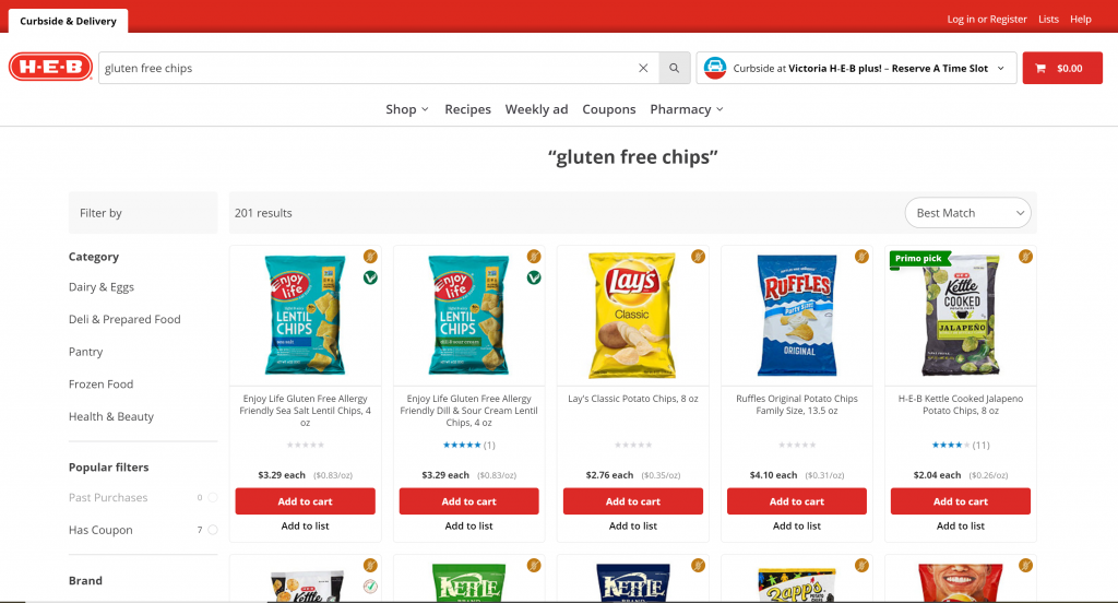
I am working on improving the desktop search and browsing experience of HEB.com. I have observed that users, when searching for items that meet special dietary requirements, do not immediately understand the icon labels and look for clues in the item title and packaging. How might we improve shoppers’ trust in the search results list and signal that certain items better match results than others?
Impact on Hypothesis
My initial hypothesis was:
How might we improve faceted search in HEB’s online grocery delivery website so that users with special dietary needs can discover and find items they need?
What I found was that users primarily focused on the top search bar and used the faceted search only secondarily if at all. The users relied on cues in the search results list itself, and only when they couldn’t find what they were looking for in the search results page would they turn to the faceted search.
Users who are used to viewing a variety of items on store shelves are more likely to bring that experience into the online environment, and they will glance at the list of search results and browse in that way before using filters to narrow their search.
What changed?
Rather than improve the faceted search results, users would benefit from an improved list of search results, giving signals about the items at a glance.
My problem statement and ideation changed to focus on this need.
Resources used
- Analysis and synthesis: MURAL
- Competitive analysis: Miro
- Ideation / Feature prioritization: Whimsical
Beneficial Tool
I preferred MURAL because it helped me work through the synthesis of my findings by being able to externalize and think about the patterns I saw with search.
Once I finalized the problem, then I could ideate solutions.
Design Ideas
Problem to Solve for
Based on my user research findings and analysis, I discovered that people searching for online groceries struggled to find items suited for special dietary needs because the experience did not match the mental model of how they expected to shop.
Users’ mental models of grocery shopping were based on the physical store, which is not like the common ecommerce experience.
How might I integrate elements of the in-store experience with the online experience?
Recommendations
Users were used to seeking out ideas via the appearance of the item on the shelf, and seeing important information quickly, at-a-glance.
- Move faceted search to a more prominent location at the top of the search results.
- Increase the size of the packaging image.
- Highlight relevant keywords when they appear in the title/description.
- Clarify icon meaning to be understood at-a-glance.
Approach
- I began by sketching out design ideas in a notebook as well as on printed out screenshots of the search results page.
- I researched other implementations of my idea for top bar filters.
- I built wireframes in Figma demonstrating the design ideas.
- I created a basic prototype of the clickable areas.
Design changes
- Search filter bar moved to top of card results.
- Users can select filter options, collapse bar for easier viewing, or reset results.
- Adjusted filters to highlight search by dietary preference.
- Increased size of card image.
- Highlighted search text if present in title/description.
- Moved icons below title with text to describe.
- Moved star ratings up next to image to make room for icons.
Takeaways
What I learned
Before
When I first approached the project, I thought that faceted search would be confusing the users and cause those with special dietary needs to have trouble finding items.
After
What I learned what that users had a very different issue. By observing and listening to users try to search on the site, I realized that their mental model of online grocery shopping did not match what I assumed. Each user was shopping the physical store or relying on search. They did not think of it as an ecommerce experience. This was a different problem to solve.
Takeaways
- User surveys are useful, but do not tell the full story.
If I had relied solely on a survey, I would not have realized that users mental model differed from what I assumed. - User observation and interviews are key.
I needed to watch users struggle with the search to understand their point of view. They would not have been able to verbalize this need. - Externalizing the data is an important step.
Analyzing and synthesizing the data in MURAL helps me see patterns and generate insights that I would not have seen if I had only pulled data points straight from the transcripts and created solutions.
What impacted the project
User interviews and testing had the most impact on this project.
As a result of this research, I generated several key insights that led me to change my hypothesis. This caused me to solve for a different problem than I initially set out to solve.
Externalizing the research I collected in Mural helps me to see the data and synthesize it into insights.
Most beneficial tools
- MURAL
- Zoom / Otter
- Figma
Next steps
I’d like to continue this project next by:
- Finishing the prototype for testing.
- Creating a user testing plan.
- Recruiting users to test the prototype.
- Testing the prototype.
- Analyzing the results.