RX Outreach redesign
Redesign for organization that makes prescriptions affordable
Rx Outreach’s site was outdated and confusing. Not only were users having trouble finding what they needed, but the phone calls the questions generated caused employees to lose productivity.
The redesign was focused on helping users find what they need online and reduce the amount of phone calls.
Project Approach
Approach
My process was simplified in order to meet the client’s budget needs.
- Discovery meeting with client to understand user needs
- Style tile design
- Wireframe design
- High-fi mockup design
The end client is a non-profit what helps people find prescription medication at lower prices.
The call center was often inundated with calls because most people skipped the website in their search. The cost of answering the calls was high, and the client needed the website to be easier to use.
Outcomes
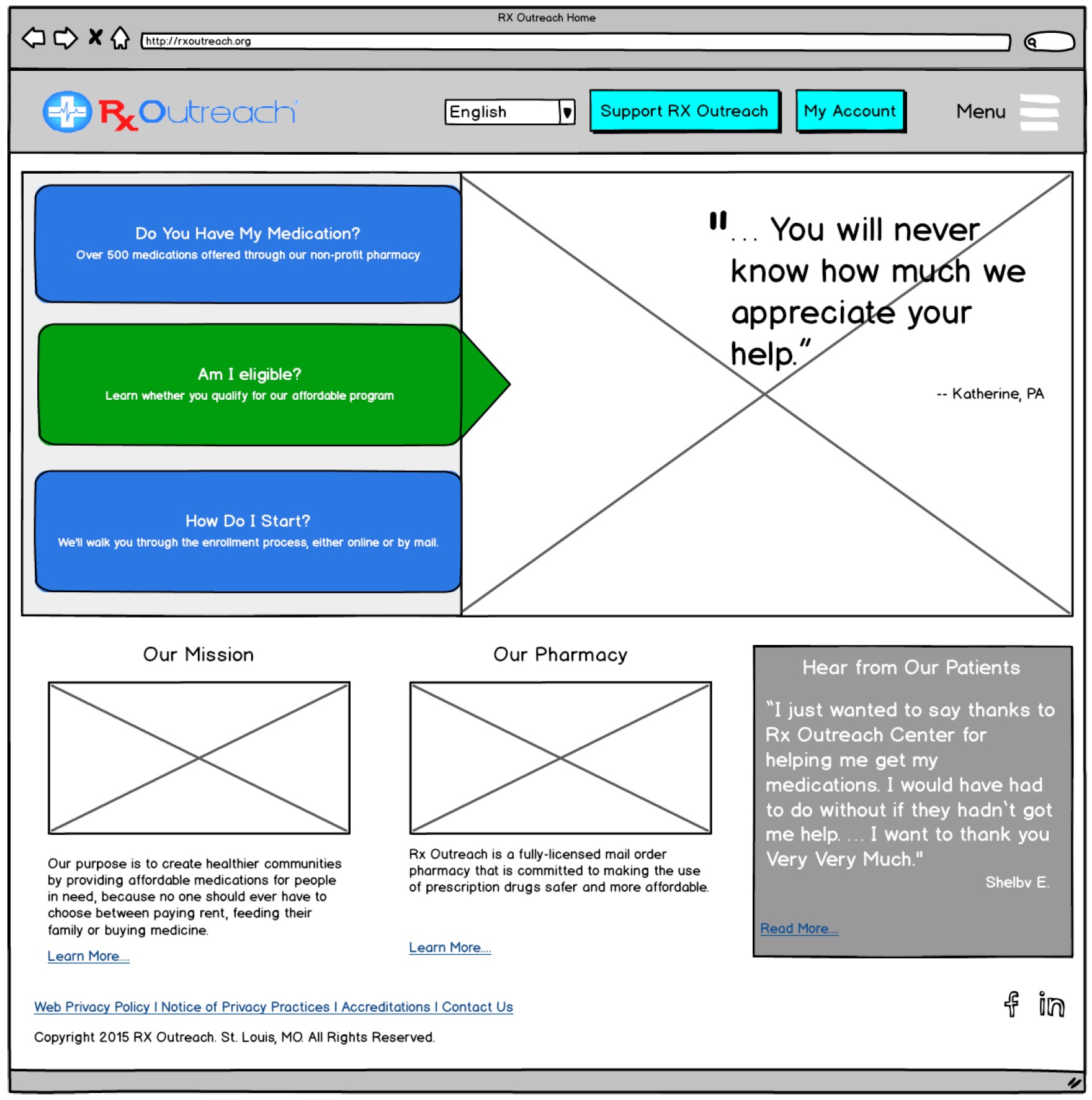
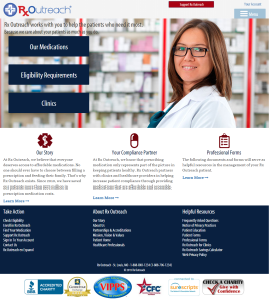
The site had a simple navigation with several key elements:
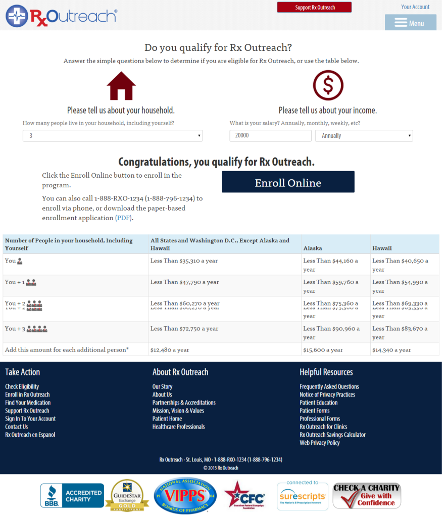
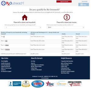
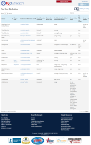
- Medication finder
- Eligibility questionnaire
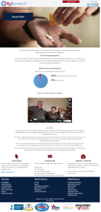
- Explanation of who RX Outreach is
- Donation form
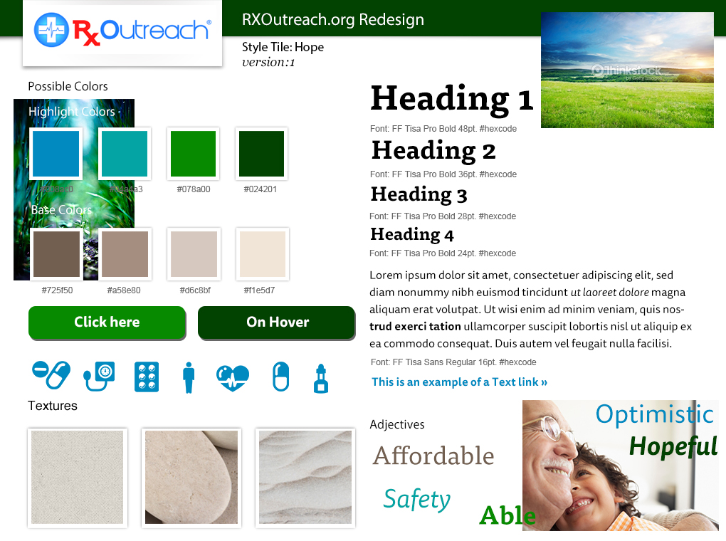
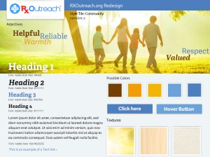
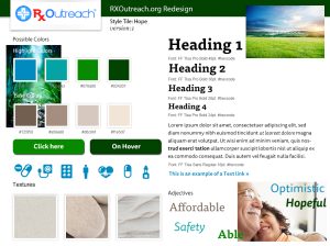
I started with the style tile for this project, providing the client with options for look and feel that would enhance their logo and brand.
Wireframes
The site had complex tables and functionality despite it’s relatively small size. As I wireframed the structure of each page, I thought it was important to keep the user focused on the core page information while keeping navigation simple.
Users were diverse in age, income level, and ethnicity. Rather than try to focus on a single group, I considered how important it would be to see other humans and think of the client as a humane service that’s trying to help. I focused the hi-fi designs on being a friendly and trustworthy guide.
Impact
The client was thrilled with the design and it was moved into development. The developer created a responsive WordPress website.
Because of the budget, I was not able to design every page and state required, so I consulted with the developer as needed during implementation.
Lessons Learned
My process has changed a great deal since I did this website. I wish I had been able to talk to users rather than rely primarily on the stakeholders to provide this information.
While I feel the project was successful, I don’t know how users responded to the site or if the site could have been improved through additional research.

Business Inquiries:
[email protected]
Interested in working with me or my company? Standard Beagle is a UX agency providing UX strategy, user research, and product design.
Reach out through my business email and visit our website at standardbeagle.com.