NKFM Coaches Portal and Admin UX
system for easy management of data for diabetes prevention programs
The National Kidney Foundation of Michigan needed an easy and efficient way to help the coaches who run their diabetes prevention workshops submit participant data. The data needed to be turned in to the staff who reported the data to grantors like the Centers for Disease Control and Prevention.
Coaches were using spreadsheets, which were easy to create but difficult to manage revisions. Coaches could also easily forget to fill out data and turn it into staff on time.
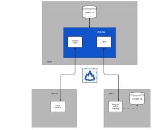
I designed the architecture of a portal that would have an app on one side where coaches would enter data, a central database, and an app for administrators to receive and download the data.
Project Approach
Approach
The client had all of its data in an internal Access database. Direct access was not possible — the cost and effort would have been too great for the budget and it wasn’t necessary to meet the MVP.
The simplest way to build a system to submit data was by building two applications connected to a central database. on one said, admins would upload initial information for a workshop, including the coach, participants, and sessions. On the other side, the coach would enter the basic data needed, then submit it. The admin would be able to review the data and export it to add to their Access database.
We recommended using Microsoft Azure, which met the security requirements. Both the coach and admin interfaces would be single-page applications, built in React, using GraphQL backend.

Outcomes
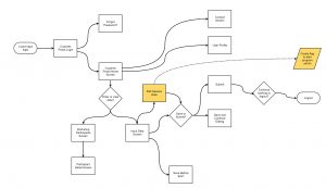
User Flows
Each user type had specific tasks it needed to be able to accomplish.
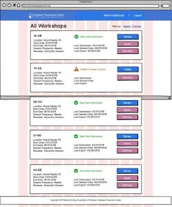
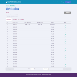
Admin tasks
- Add workshop
- View submitted data
- Export data
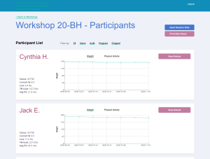
Coach tasks
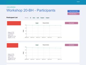
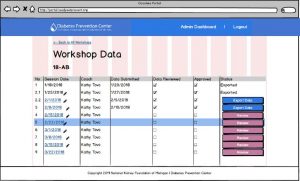
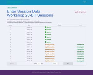
- View workshop
- View participant data
- Add or edit participant data
- Submit data
On the admin side, I realized that it would be much easier not to require the admins to add each workshop manually. My admin flow focused instead on importing a spreadsheet with all the data in the correct form and then allowing the admin to edit any information needed. I also needed to make sure that this data was viewed and approved before it was sent to the front end. Admins would be able to hold workshops and then publish later to ease their workflow.
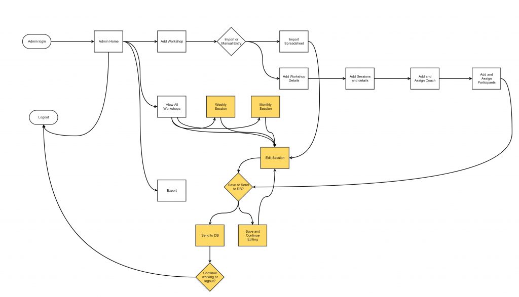
One the coaches side, the client explained they needed a way to allow coaches to edit dates of sessions, just in case of a snow day or a need to reschedule for holidays. Also, when the data was submitted, we wanted there to be a flag so the admins would know that new data was sent.
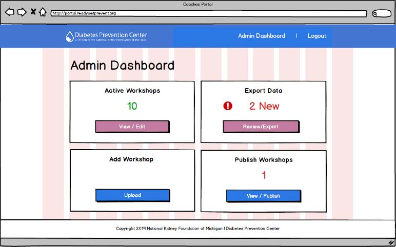
Wireframes
I typically sketch out wireframes before I digitize them, but this time I started in Balsamiq. Why? My dominant arm was in a sling after undergoing shoulder surgery, and I was much faster using a mouse and keyboard with my left hand than using a pencil. I designed each of the primary screens for the flow and asked for feedback from the developers as I went. The styling would come directly from the CSS used on the Diabetes Prevention Program website, so there was no need to use a style tile. Instead I referred to the major components for how elements would display.
User Testing
Fortunately, despite the budget constraints, the client agreed that user testing would be beneficial to include in the project. The client helped recruit six program coaches to test the wireframe prototypes I prepared in Invision. Each of the coaches was located in Michigan, so we leveraged Zoom to conduct and record the tests. Our goal was to answer this question:
Are users easily able to easily save and submit data to program administrators?
Feedback was positive. Most participants were easily able to follow the user flow. The main feedback was to make additional labels for data submissions status and improve the clarity of the data submission box.
Impact
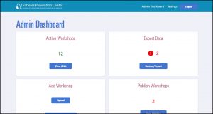
Following design iterations, The Standard Beagle developers built out the designs into a HIPAA compliant portal that is still in use today.
My team maintains the portal and we have executed a number of enhancements and improvements.
The portal system started off with just a hand full of workshops and today is manages dozens.
Lessons Learned
Before this project, I had always conducted user testing sessions in person. So this was the first time I conducted remote, moderated sessions. I learned important lessons about preparing participants who were not used to Zoom or video conferencing.
I also learned how important rapport and clear communication during a testing session was. Some of the participants had trouble hearing the instructions and tests went longer than expected because of the need to slow down and explain.

Business Inquiries:
[email protected]
Interested in working with me or my company? Standard Beagle is a UX agency providing UX strategy, user research, and product design.
Reach out through my business email and visit our website at standardbeagle.com.