Helicopter service iOS app design
IOS app design
How might we create an easy-to-use tool for first responders at the scene of an accident to call for a helicopter to evacuate a patient?
My client was a consulting firm working with a company that provides first-responder helicopter services.
The app was designed to allow emergency responders and personnel order a helicopter to a hospital or accident scene.
Project Approach
Approach
I joined the project after the initial discovery and requirements gathering was already completed. Talking with users was not an option in the project, so I relied on the end client and product manager to provide user information.
I focused my discussions with the client to understand more about the context of how the app would be used and accessed. I wanted to fully understand how the users would interact with the app and under what circumstances.
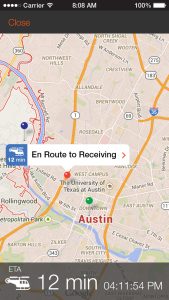
I learned that the users would be in stressful situations, often at night. I also learned that they might not be near an obvious address. They might only know nearby landmarks.
It was also important for me to design features that the development team would be able to fulfill, so as I wireframed concepts, I reviewed them frequently with the product manager and dev team.
Outcomes
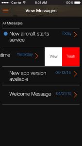
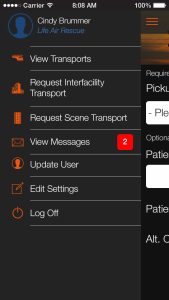
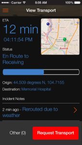
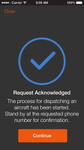
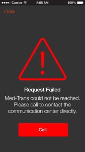
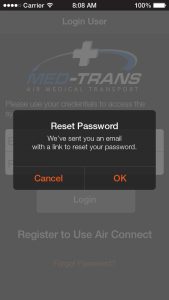
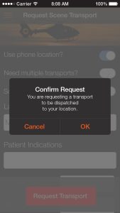
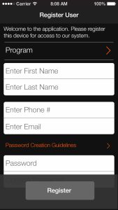
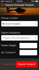
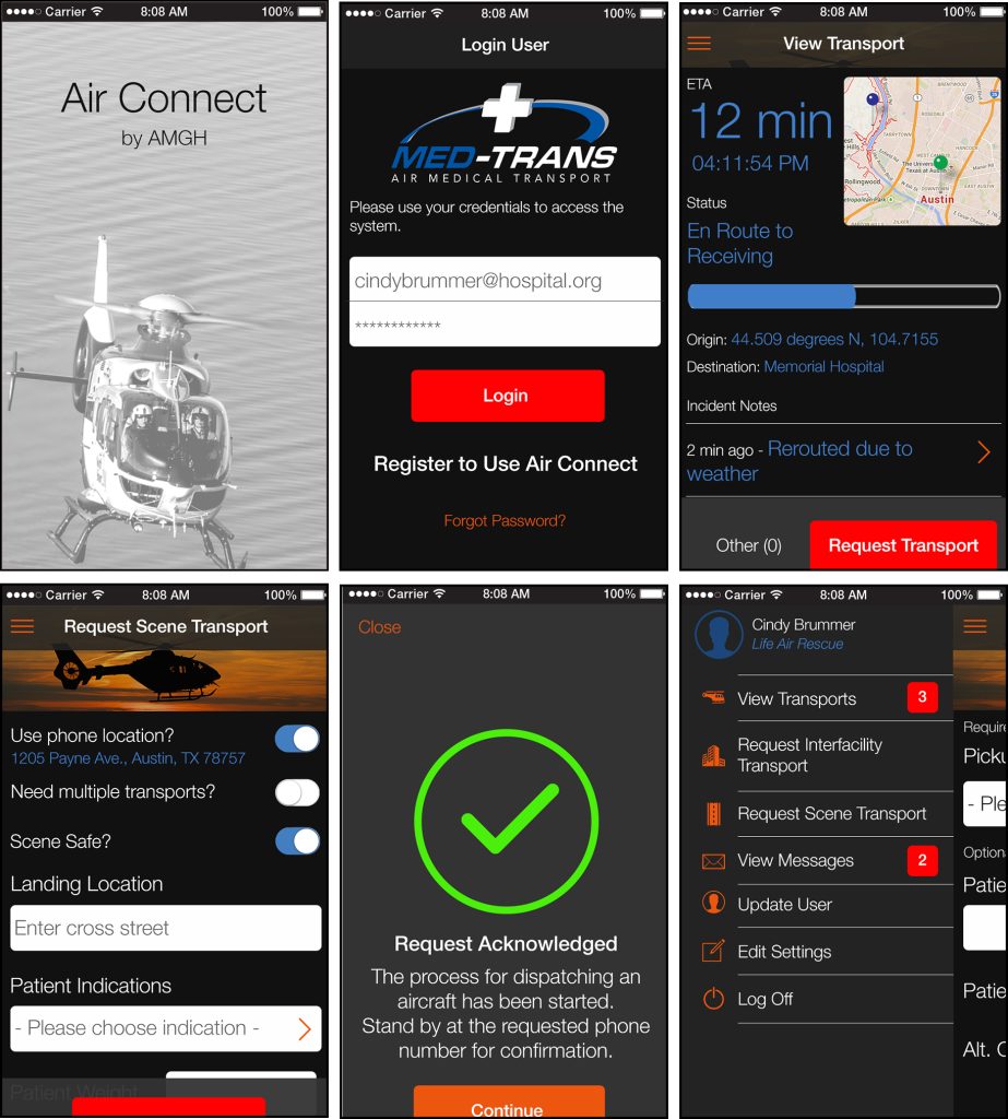
Because the users could potentially access the app in low-light or extreme weather situations, I settled on a dark design with bright calls to action.
The contrast would be easier to see at night, when many of the users would use the app. I also used larger, bright text, which would be easier to see if the user was in crisis mode.
Each screen had multiple states:
- Empty
- Normal
- Active
Because the client was anxious to get started on development, the screens were prototyped so they could walk through a realistic flow.
Impact
The prototype was so realistic, in some cases, the stakeholders thought the screens were a developed prototype.
Following handoff, the development team built out the designs as an iOS app. The client had not settled on a name for the app during the design phase, and changed the name for release.
The app was released about 12 months after I handed off the designs. My client, the consulting company, was impressed with the work and invited me back for a future project.
Lessons Learned
One of the toughest parts of the project was having limited knowledge of the end users.
While my client provided me with all of the discovery information and provided a briefing, the information was primarily technical. In this case, I had to rely on assumptions about situations that users would find themselves in and how the app could address that context.
It was also the first time I had designed for iOS, so I dove into the iOS design docs for patterns and requirements that would need to be included in the app.
Business Inquiries:
[email protected]
Interested in working with me or my company? Standard Beagle is a UX agency providing UX strategy, user research, and product design.
Reach out through my business email and visit our website at standardbeagle.com.

