Health District Website UX
User-focused redesign to put the focus on patients
Central Health needed help redesigning its main website to focus on patients.
We worked with a Dallas-based marketing agency on this project, which would handle the visual branding.
Our role was to bring user experience expertise.
Project Approach
Approach
Our phase of the project followed four main steps:
- discovery and background research
- user research and testing
- UX design
- UX verification through user testing
The stakeholders felt the site needed a new look and feel and that it needed a new patient-focused lens. Findings uncovered in our initial review of the website brought up the following questions:
- Do users understand where services and location information can be found on the website?
- Are users confused by the multiple layouts used throughout the site?
- Do users understand how affiliates comprise the Central Health Enterprise?
- Do users understand how to access information about MAP and how to enroll?
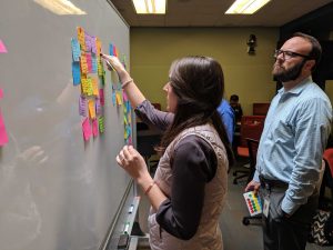
To kick off the project, I knew it would be important to align everyone on the project. I requested a vision building meeting to assist in defining the problem.
Vision meeting
Vision meeting participants agreed on the target demographic for the redesign:
- Potential patients
- Current patients
- Travis County residents
I also learned that potential and current patients often have a mindset that is more crisis-oriented. These users need to know information “right now.” Often, they prefer to send electronic messages rather than calling.
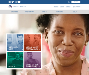
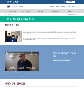
In fact, the existing Central Health website was never designed to be a patient-centric tool. It was intended to serve as a clearinghouse for staff members and board members to put information. This new direction would focus on how to serve the patient, not the Central Heath staff.
research
I looked at the existing site through:
Analytics
Questions included:
- Is the website mobile friendly?
- Do pages load in under 2 seconds?
- Is there an obvious relationship between the navigation and the page the user is currently viewing?
Key recommendations:
- Ensure site redesign templates include mobile phone and tablet wireframes that are specific to mobile devices. Focus should be given to mobile devices using Apple iPhone.
- Use bolder navigation design to provide additional clues to user.
- Add breadcrumb navigation to the site layout/templates.
- Use a layout framework that is consistent across page templates, grouped by content type.
- Consistently show toggle in the same manner and in the same location as appropriate.
- Clearly indicate the most important content on the page with a clear call to action item focused on the user stories developed by the stakeholder.
- Continue to provide multiple opportunities to explore deeper into the site.
- Remove or redesign content layout to add additional white space.
- Design a clear hierarchical content structure.
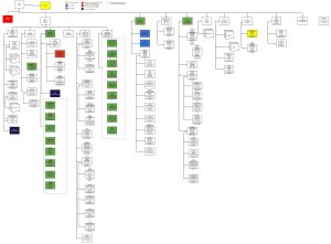
Content Inventory
Because the website review only touched on key pages and templates on the site, I conducted a full inventory to catalog all pages and note website elements and functionality. This inventory informed the testing scenarios as well as capture an understanding of all pages on the site to ensure that the design takes them into account.
User Testing
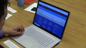
Methodology: Six guerilla recruited participants, tested in person at the Southeast Health & Wellness Center. We recommended this method because likely participants would represent many of the typical users on the website.
Findings
- Search is a key element that users will employ on the site.
- Users expect search to function like Google, i.e. – using natural language keywords, rather than exact match keywords.
- Users expect to find Spanish in the top right corner of the site on every page.
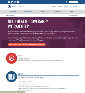
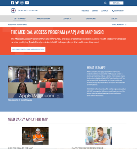
- The majority of all traffic on the site is to information about the Medical Access Program (MAP) and finding information in this section is not immediately obvious or easy for users.
Recommendations
- Ensure site redesign templates include mobile phone and tablet wireframes that are specific to mobile devices. Focus should be given to mobile devices using Apple iPhone.
- Use bolder navigation design to provide additional clues to user.
- Add breadcrumb navigation to the site layout/templates.
- Use a layout framework that is consistent across page templates, grouped by content type.
- Consistently show toggle in the same manner and in the same location as appropriate.
- Clearly indicate the most important content on the page with a clear call to action item focused on the user stories developed by the stakeholder.
- Continue to provide multiple opportunities to explore deeper into the site.
- Remove or redesign content layout to add additional white space.
- Design a clear hierarchical content structure.
Outcomes
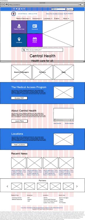
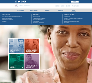
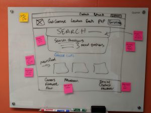
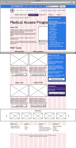
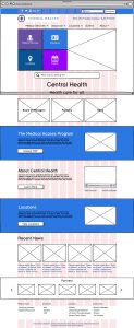
I designed more than 10 templates, and my wireframes showed mobile views as well as planned interactions.
User Testing
The user testing attempted to answer the following questions:
- Does the proposed solution help patients find services and information on the website?
- Does the proposed solution help users clearly understand how to access Spanish-language resources?
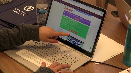
User testing was conducted in-person using wireframes loaded into Invision so participants could click through like a real digital product.
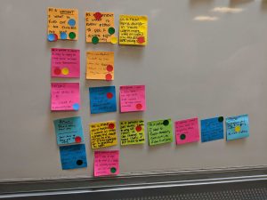
Insights
- Users did not distinguish MAP as an insurance. They consider it a Medical Service.
In general, when users were asked to find MAP information, they did not consider searching under insurance. They looked under Medical Services. This behavior indicates that users do not distinguish the need for coverage from the need for care. To users, MAP is care, and the most logical place to find care is under navigation labeled Medical Services. This indicates that MAP should be relocated in the navigation. - Users assumed all locations would be under locations.
The users who were asked to find MAP locations typically did not think to look under MAP. Instead, the looked under locations. The current navigation map had three pages under locations (SEHWC, Downtown, and Eastern Travis County initiatives). The MAP locations page was under the MAP section. This indicated that MAP locations should be relocated in the navigation. - Users did not rely on search.
This was both surprising and validating. The users in this study did not use search. They commented that the site was easy to use and would not have needed it. This indicated that the site flow is improved and users feel confident in their navigation choices, without relying on search for basic and important tasks. - Users rarely accomplished the tasks the same way.
Each user navigated the site in a different way. Some used the top navigation. Some used the home page hero boxes, and others through the content. This indicates that having multiple pathways through the site to the same destination is an important element that should be retained. - Users did not scroll.
This may have been a function of working with a rough prototype, but interestingly, users focused on the top navigation instead of scrolling. This is in stark contrast to the original user testing group, which focused on reading the content. - Users primarily use mobile devices.
Most participants shared that they frequently use mobile websites and apps. This indicates that the mobile-first approach in the design is an important element.
Impact
The final wireframes were annotated and delivered to Belmont Icehouse, which created the hi-fi designs for the site. The hi-fi’s strongly resembled the wireframes in content and structure.
My team at Standard Beagle implemented the site in WordPress. Read the case study here.
Today, the site is largely the same in terms of structure and navigation, and the client continues to point to my research and recommendations. (In fact, we have been called in to work on additional user testing projects.)
Lessons Learned
My biggest lesson from the project is in how well the Vision Meeting worked as an alignment tool. In fact, I continue to reference this project in my talk on stakeholder management.
I suggested the vision meeting because of how many stakeholders would be involved in the project. It helped everyone align and gave us a clear direction. But it did more.
The session helped me build trust with the stakeholders and develop rapport. This trust and rapport was incredibly important later when I was called to present my findings in front of the Central Health community board. A board member strongly questioned my research methodology and recommendations, but all of my stakeholders backed me up and our recommendations were allowed to move forward.
Business Inquiries:
[email protected]
Interested in working with me or my company? Standard Beagle is a UX agency providing UX strategy, user research, and product design.
Reach out through my business email and visit our website at standardbeagle.com.