Central Health Kiosk App Design
UX design of web app for reaching more potential patients
Central Health, an organization which provides access to healthcare services to those 200% or below the Federal Poverty Guidelines by coordinating a network of area healthcare providers, needed technology to help pre-screen and capture information while at health fairs when reaching and educating residents.
The tool would be used at health fairs. The goal was to allow more people to determine if they are eligible for the program if the health fair representative was not available. It was also important that the tool be available in Spanish, because over 50 percent of the audience would be Spanish-speaking.
Project Approach
Approach
We learned from Central Health that the tool needed to have three sections:
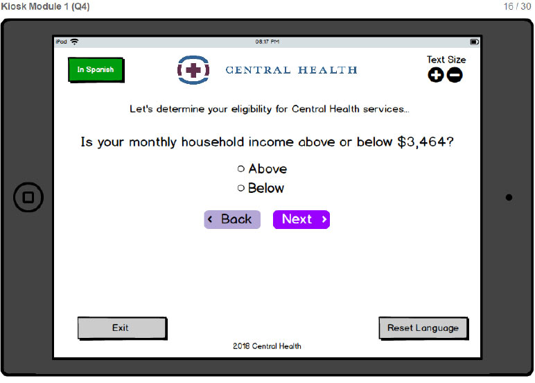
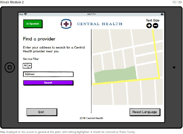
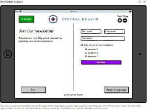
- structured eligibility form
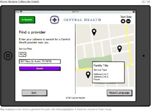
- location finder
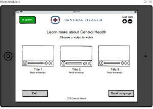
- marketing videos
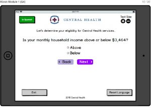
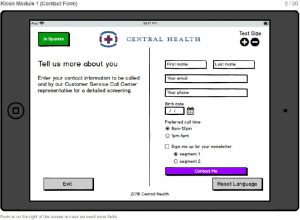
The eligibility form would be used to help a specific group of people determine if they are eligible for Central Health’s medical access program. The location finder would help people find a Central Health location. And the marketing section would show videos about Central Health and what the organization does.
We focused our efforts on a kiosk app optimized for large tablets. The kiosk could be set up as a tablet that could standalone on a table, making it easy to set up. People could also browse and use it when the health fair representative was busy with others.
Architecture
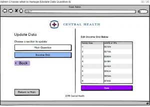
Before designing the user interface, we designed how the app would be managed and served to the tablets.
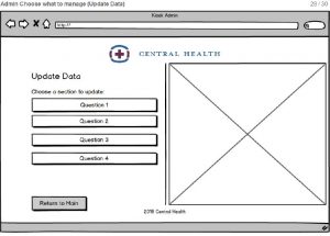
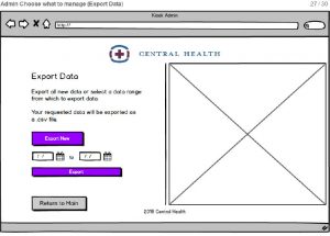
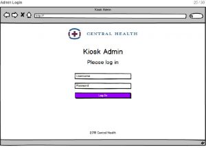
We had to take HIPAA and security into account. We designed a system where the kiosk app would collect information and send the data to a central database. On the management end, we designed an admin app that would be accessed by Central Health staff to update information in the app and access data collected.
Next, we designed how the app would collect and retrieve information from the database.
Outcomes
I designed the wireframes for each page of the flow — creating mockups for both the front end experience as well as the administration of the data.
User Testing
Our team tested the Central Health Kiosk app on 6 patients at a Central Health clinic in Austin. We had five females and one male, each given around 20-30 minute time slots.
The users were presented with multiple scenarios to see how they would navigate around the kiosk. First, each participant was asked to give the overall impression of the app from first glance. Then they were tasked to make it through the eligibility screening given certain information. Next, they were to find a clinic and transportation to it which would lead them to explore the map module. The last two tasks that were conducted depending upon time were to sign up for the newsletter and switch the language on the screen.
For the most part, we received positive feedback about how easy the app was to use. The users made small comments about some of the wording or what they would expected to see. On the main dashboard, multiple users did not think to click find a doctor to find a clinic or a map. They expected to see a list of doctors behind that screen. Additionally, the users tested did not feel comfortable giving personal information online.
Feedback
- Change “Find a Doctor” to “Find Health Care Services”
- Change the contact button at the end of the screening to a more firm call to action
- Display the starting pin on the map in another color
- Enlarge the radio buttons
- Have different colored pins for the different types of providers
- Make the provider type list more condensed
- Add a search button on the map module
We made improvements to the wireframes and delivered them to Belmont for the visual look and feel.
Impact
The client deployed the app soon after we finished developing it.
You can read the case study on standardbeagle.com.
It fell out of use during the pandemic when health fairs were suspended and the team was forced to reach out to potential patients in different ways.
Lessons Learned
My ah-ha in this project happened during user testing.
One of the participants had very long fingernails, and she had a hard time tapping on the click targets, even though they met the minimum size.
In another case, a participant was homeless, and they did not have the information the app required to move forward.
In both cases, I was able to iterate the design to make the needed improvements.
Business Inquiries:
[email protected]
Interested in working with me or my company? Standard Beagle is a UX agency providing UX strategy, user research, and product design.
Reach out through my business email and visit our website at standardbeagle.com.