Health Clinic UX Redesign
Maximizing the patient digital experience
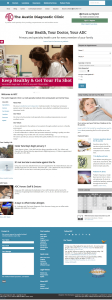
The Austin Diagnostic Clinic’s doctors and providers serve thousands of patients in and around the greater Austin area. ADC’s services span both primary and specialty care, as well as nearly a dozen auxiliary services. It has more than 150 doctors and mid-level providers seeing patients at 17 Central Texas locations.
The clinic wanted to attract more patients in an increasingly competitive medical industry.
While ADC had hundreds of established patients, it was becoming increasingly more difficult for the clinic to distinguish itself. Austin’s population was rapidly growing, and according to market research, fewer newcomers were hearing about ADC, and when they did, residents confused ADC with other local clinics.
Project Approach
Approach
Discovery
My first task was to analyze the clinic’s digital strategy.
There were 750 pages of content on an existing domain with established domain authority. Over time, the content had become disorganized and hard for some users to locate quickly.
Based on feedback from emails and phone calls to the marketing department, new site visitors reported they had trouble locating information because of the way it was organized. Anecdotal evidence indicated that visitors were frustrated when they visited the website, which affected their feelings for the clinic itself.
The decision was made to implement a new digital strategy:
- Redesign website
- Establish social media presence and drive traffic to website
Methodology
Inventory: Each piece of content was cataloged and analyzed for its contribution to the site. Through a collaborative process, ADC decided which content should be kept or removed. Content was flagged if it needed to be reorganized. A content strategy was developed to help guide future content creation and how it should be organized.
Competitive Analysis: The marketing team was asked to answer a series of questions about each of the competitor’s websites. In addition, actual patients visited the clinic and tested the clinic’s website as well as their competitors’ websites. Users were asked to complete a series of tasks. Their interactions were analyzed to understand where they had trouble and why.
User Interviews: Each stage in the process was tested with a set of real patients. Stakeholders were also invited to participate. Over several days, stakeholders were invited to sort content to understand how real users think about content organization.
The results of the activities were used to design the new site’s information architecture, visual appearance, navigational structure and backend site management.
Outcomes
Following the launch of the initial design, I attended a design conference, and realized that the CMS framework was limiting and needed to be upgraded.
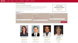
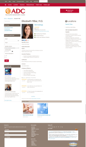
I successfully presented my case to my managers, and I was approved to rebuild the design using the Genesis framework. Additionally, I saw, based on feedback, that some upgrades needed to be made to our doctors section.
Iterations
the following year, I made adjustments to the site’s framework and design to make it more mobile-friendly. We also added new features — including a new doctor filter and search.
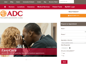
The marketing department was also given clearance to add a request appointment form to the website. Since this was a new initiative, we worked with the clinic’s business office to map out how appointment requests would be handled once they came through the website. We tracked the form’s performance through goal tracking in Google Analytics.
Impact
Results were encouraging. In the first few weeks of the launch, we braced for phone calls from patients confused as to where to go. But NO ONE called. Not one patient had trouble using the site or complained.
The only calls we received were from internal staff members who had memorized a specific, long path to documents they frequently used. Once we showed them the new organization, they no longer needed our help.
Website traffic steadily increased and online visibility helped drive new appointments.
- 61% increase in web traffic
In 2016, ADC averaged 90,000 visitors per month, an increase of more than 60% since 2011. - New and established patient appointment requests
ADC was capturing patients who might not have wanted to call during the day for an appointment. Appointment requests completed online had a .71% conversion rate in 2016.
Lessons Learned
This project was the first one where I was allowed to practice all of the steps in the UX process. Here’s what I wish I had time for in more client projects:
- User testing on competitor sites
The insights that came out of this step were invaluable for determining new features for ADC’s website - Content sorting with stakeholders
By bringing my colleagues into the process, I got to see how lots of people viewed content organization so I could apply that to my design. - User testing
Most of my design projects exclude user testing, either because the client lacks budget or doesn’t see the value. In this case, we tested frequently and at every stage.
Business Inquiries:
[email protected]
Interested in working with me or my company? Standard Beagle is a UX agency providing UX strategy, user research, and product design.
Reach out through my business email and visit our website at standardbeagle.com.