Research & Design of Synchronous Game App
Harmonious
This project was inspired by an issue I personally faced. My father is aging, and I tried to find ways to connect with him that will help him be social as well as actively engage his brain in order to prevent cognitive issues.
Why? According to the Centers for Disease Control and Prevention, loneliness and separation can lead to cognitive decline and dementia. Older Americans spend a lot of time alone when they live independently. A recent Pew Research Center report found older adults spend more than half of their time alone.
The problem is, while socialization is good, it’s better to engage other parts of the brain in order to protect it from decline. Researchers have found that regularly engaging in a mix of activities — social activities, learning, and playing games — provides the most benefit.
How might we design a tool that engages family members face-to-face over geographic distance while providing opportunities to engage in memory-building and active learning?
Project Approach
Approach
Research goals
To get started on solving the problem for seniors and their families, I needed to understand communication among family members.
- Understand how families connect when they are geographically separated.
- Understand challenges and barriers with socializing
- What solutions have families come up with?
Methodology
Method: Semi-structured, qualitative user interviews: 16 total
Data Collection: Data collected through Zoom remote video recording and through notes, then transcribed with Otter.ai
Participants: 16 participants from targeted user profiles: 8 adult children of seniors, 8 seniors, living independently
I focused on qualitative interviews so I could get inside the heads of the user groups and better understand what was happening. This was successful because I was able to probe and understand more about the daily habits of the people I talked with, and I found a number of patterns.
“Sometimes I worry about her because she’s by herself. But… she’s kind of a sassy lady. So she’s very self sufficient and independent.”
“…Sometimes it gets a little boring. It’s a little tough being single — I’m a widow…. a little hard to start all over again.”
Outcomes
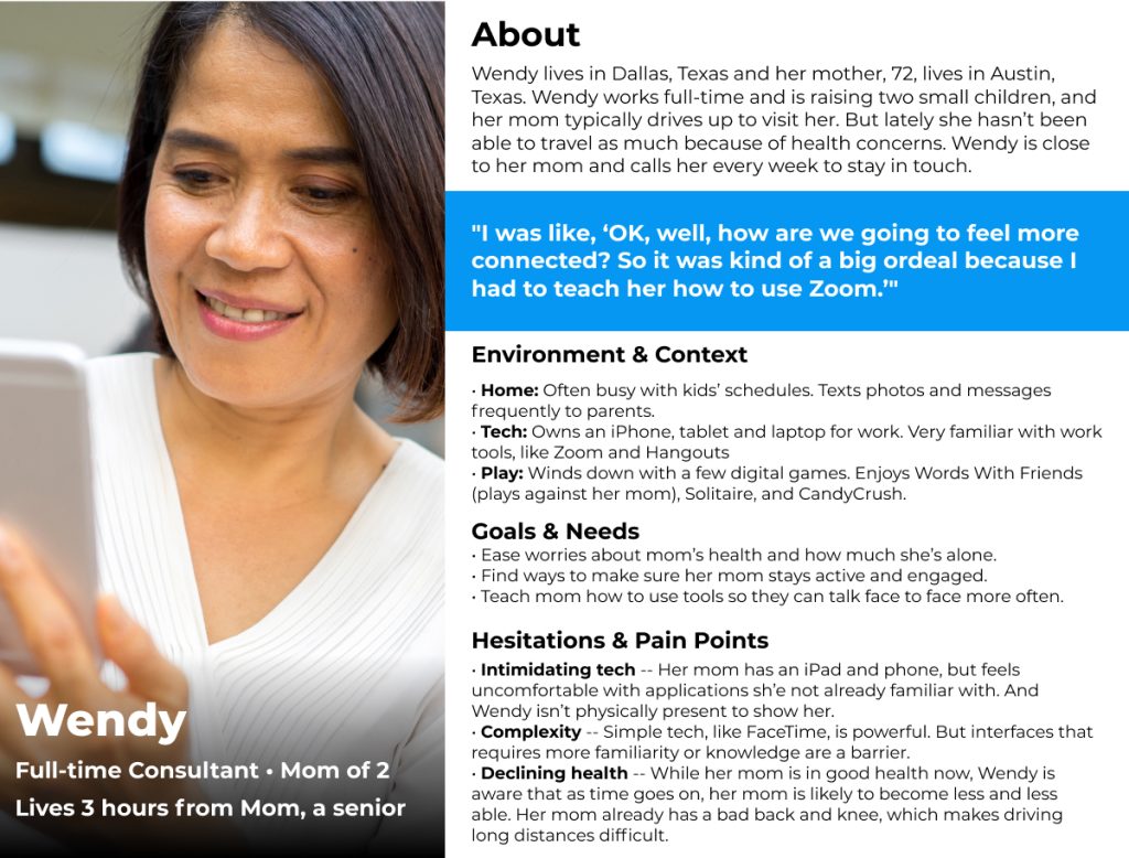
From my research I was able to paint a clear picture of the users — especially of their pain points and frustrations.
Insights
I learned a great deal about family connections from my interviews and met my research goals. Here are key insights from my interviews:
- Users need ways to connect more than 2 people in families
- Families need technology to be simple and inclusive of all abilities. Technology is intimidating for many and it need to be accessible to everyone in the family.
- Users shy away from playing games with people they don’t know. They will play multiplayer games if they are playing with people they personally know.
- Families are busy, and find time to be a problem. Users need a timeboxed method for engagement so that they can overcome time constraints.
Design
After brainstorming, I organized my ideas and sorted them based on feasibility and impact. I followed this up with an exercise to assign values based on impact and effort. The following ideas rose to the top:
Key features
- Most users indicated they enjoyed word games and sought them out for fun and challenging play.
- Most users only had a short amount of time — games that took hours would not meet their needs.
- Game play can’t be complex — using a finger to drag and capture words would be simple to master and more accessible than a mouse.
- Most seniors had an iPad readily available and were familiar with the interface.
User feedback
While wireframing and prototyping, I wanted to get feedback as early as possible since I was sure I was missing key components I hadn’t thought of. Several issues floated to the top that I needed to address:
- I’m confused about what’s behind the menu — is it stored data about the game or how to play?
- Do a little video for showing the winners — like how Mario Kart does it.
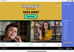
- When I’m online, can I see a list of my friends?
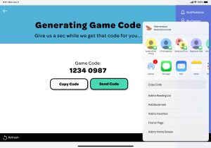
- Do they need a game code if inviting through the app? Game code should only be public; no way to add people
After completing the hi-fi screens and a prototype, I tested again. This time I performed task-based usability testing with five remote testing participants — sourced from my original interviews. This was a wealth of information, and it uncovered a number of new issues to address.
Issues uncovered
- Onboarding confusion: Users thought app would automatically add contacts from onboarding screen.
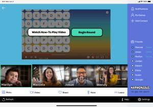
- Video too fast: Users found instruction video to be fast and not clear about how to play.
- Start game from panel: Users thought they could start a game with users on the right sidebar.
- More settings control: Users requested additional options for sound level and text size for accessibility.
- Word challenges: Users wanted to increase interaction among participants on the call. One suggestion was adding “challenge a word.”
- Bigger text: Some alert boxes — especially those from the iOS UI kits — were too small to read.
- Bird confusing: Several users commented that the bird looked like the Twitter bird. I decided to change the color to remove the confusion.
Branding
I designed the app’s branding while wireframing and testing the concepts.
Brand Archetype
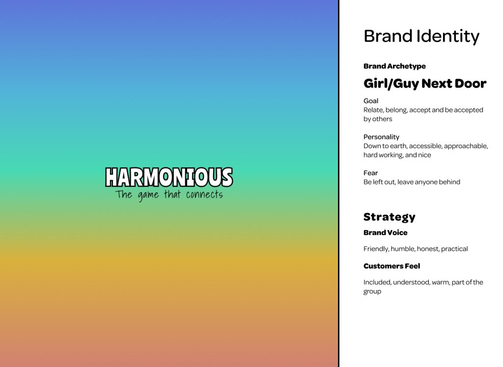
I decided that the overall archetype for my app was Girl/Guy Next Door.
- Goal: Relate, belong, accept and be accepted by others
- Personality: Down to earth, accessible, approachable, hard working, and nice
- Fear: Be left out, leave anyone behind
Brand Strategy
- Brand Voice: Friendly, humble, honest, practical
- Customers feel: Included, understood, warm, part of the group
I created the Harmonious logo as a typographical logo with two fonts:
- Ranchers (Google font) for the name mark
- Shadows into Light (Google font) for tagline
These fonts were fun and helped emphasize the Harmonious accessibility. I designed the name mark to be used alone or with the tagline in one of the five shades of the color palette.
While these fonts worked for the logo, I wanted a separate font for all other text in the app. I chose Adobe Typekit font Omnes for heading and body type styles because of its roundness, which indicates friendliness and approachability. Additionally, it is easy to read and pairs well with the typographical logo.
I chose a character — a little bird — to be a friend on the user’s journey, and based the color palette off of the bird’s color. The palette is fun, easy-going, and joyful.
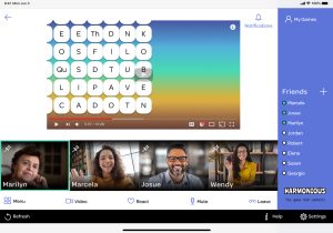
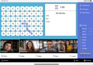
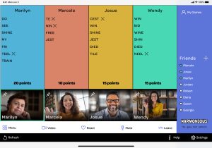
I addressed the issues I found in user testing in my next iteration of the screens. I created this prototype:
Impact
I decided to do another round to see if my iterations successfully addressed several key areas. I again performed task-based usability testing with five new remote testing participants, sourced from my original interviews.
“You’re sharing an experience. You’re sharing an adventure. You can talk together. I really think this could be a loneliness buster. I think it’s great.”
“I want to play this.”
What worked
- Sidebar menu makes sense: Users were able to correctly guess what was behind the new menu buttons.
- Initiate a game with friend: Users understood that a game could be initiated with a friend from the side panel.
- Understand friends online: Users understood which friends were online and were not confused.
- Onboarding microcopy: Users did not think that onboarding meant they would be connecting all of their contacts at that moment.
- Bird color: Users no longer mistook the bird character as the twitter bird.
What to improve
- “Help” button not intuitive: Users were not always clear that a “how to play” video was behind “help”.
- Challenge feature affordance: Users liked the feature, but it wasn’t clear how to initiate it.
- Fix slow performance: Figma was lagging and causing performance issues with testing. I have already addressed this.
- Slow video down: For some users, the help video went too fast.
Lessons Learned
Research
The process was helpful, but I wish I had probed deeper in my initial interviews to better understand this piece. Had I more time, I would have gone back to my interview subjects to ask them more questions.
I also realized I really didn’t have two customer journey maps, but instead one. These were so similar, and the user types were not different enough to need two journey maps. I planned to iterate the journey map in a future stage of the project if there was enough time.
Test, test, and test again
The highest value came from getting feedback directly from potential users.
Go hi-fi early
By strategically moving into hi-fi earlier than I had planned, I created a cohesive system that was easy to update.
Think through components
Some of the components I created needed to be reworked.
Work in a team
This project was huge for one person, and I wish I had been able to tap into the brain power of a team.
Business Inquiries:
[email protected]
Interested in working with me or my company? Standard Beagle is a UX agency providing UX strategy, user research, and product design.
Reach out through my business email and visit our website at standardbeagle.com.

